tiny chocolates.
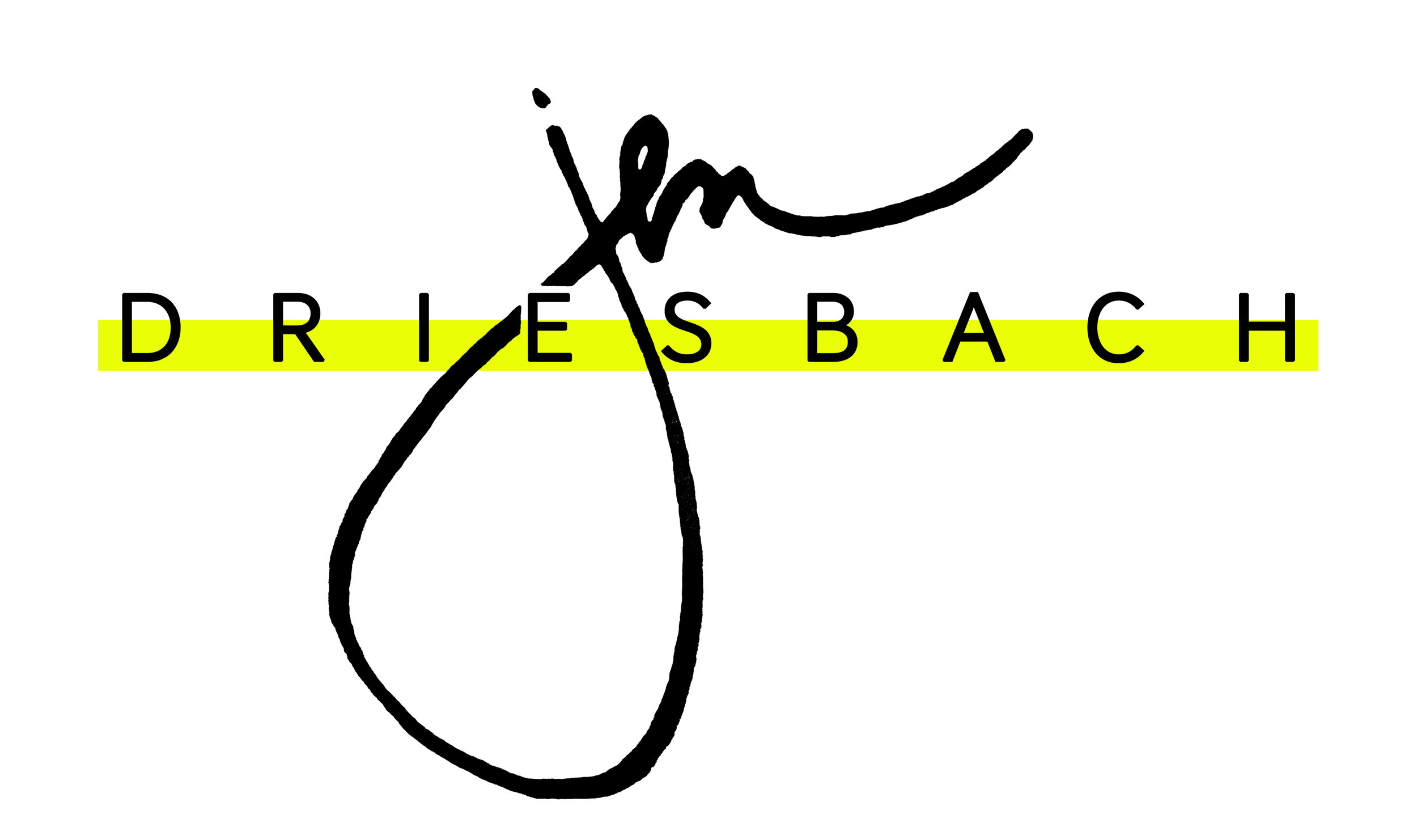
"jen." you begin..."why do you design logo's? why is it important?"here's my thoughts on branding/logo design.most successful business', either small or large, have a distinctive logo...that eventually becomes their brand.and yes. when I write the word brand I think of a cow mooing getting branded by a big hot metal poker. :)try thinking of Pepsi without the colorful logo.(why you would be drinking a pepsi instead of a diet coke is a whole other blog post!) :)you can’t, can you? or at least it’s not easy. that’s because you have seen them both together several times and therefore your mind associates them that way and they are imprinted in your mind as one.or even better. try thinking about old spice without the logo...or now, the old spice guy commercial that even furthur imprints old spice in your mind...difficult to separate the two.it is easy for people to forget names but adding a logo to go with your business name can make all of the difference. if someone has never seen your work or has never heard of your company then your logo may be all they have to judge you by.which is where I come in.part of my spazziness is that I care entirely too much with how things look and how they are packaged.matt is constantly making fun of me when I have a bookstore date with myself and come home with a little black box from a.j.'s.I totally believe the tiny chocolates actually taste better because they come in that tiny black and gold miniature box with the perfect gold logo right on top!did I pay $4 for a tiny chocolate that I could have boughteight hershey chocolate bars for the same price?!you bet I did.and it tasted better. :)I totally believe that a logo can be a powerful thing in marketing yourself and in cementing who you are in peoples minds. and I think it should display who you are as a business...some are quirky, some are modern...these last ones that I designed are a little modern and slightly classy for a photographer friend based out of new york! she loved the idea of signature combined with a modern serif font...minimal with class. :)
the last one was the winner! (just click on it to check out some of her previous work) can't wait to see your business cards + site! :)


