graphic design
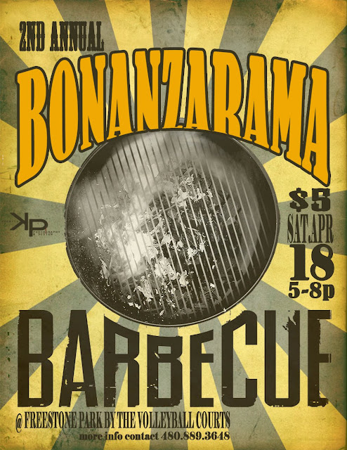
this one was for our student ministries BBQ night...I saw an old circus poster that I wanted to kinda use as inspiration...
this is a 4x6 two sided card that we gave to the students to ask friends to come to our wednesday night study...it started as a old billboard picture that I added effects and a grid to...change up a couple of the squares and there you go :) the back was solid black with a map of the location + more typography...
these next two are just two of the backgrounds I designed for our church evening services that I play music at...I typically design three slides for the evening...but I liked these two :)

I have a weird affection for rainbow spectrums :)


